I occasionally like to tear out pages for posters. This month's cover would be one such poster. The colors in the headpiece are so vibrant and the necklace is just cool.

To me, this cover promises a lot about the main spread, as does any cover of a magazine. It creates an ambiance and sets the attitude of the magazine - that is the purpose of a cover. Looking at the inside feature, however, was a little lackluster. The cover has beautiful, bold colors, but the first pages of the spread give us nude neutrals and a little black dress that's been done so many ways so many times. It's not really new and exciting.


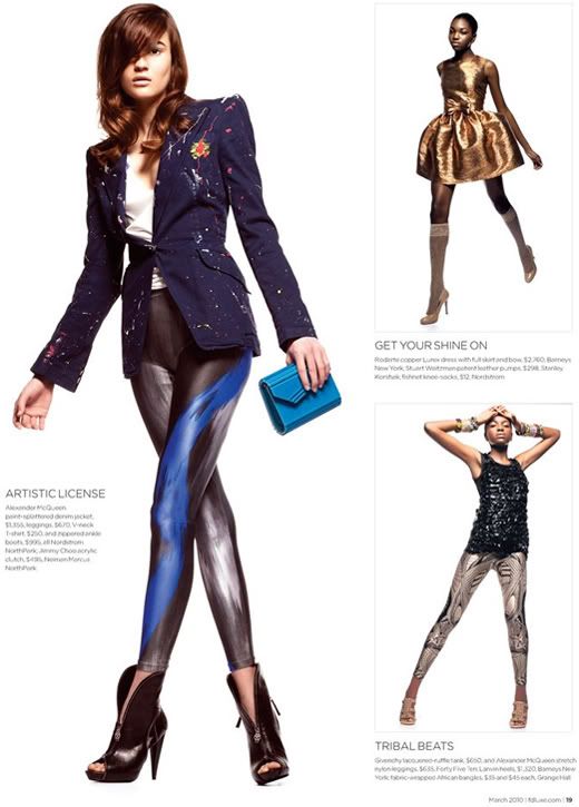
Enter page three and we're treated to the Dallas color of the season: blue. This is gonna be a hard season for me (-__-). But the shape, the attitude, the texture - now we're talking (McQueen). The other styles are still cute with little wow (and neutral - where's the color you promised?) but they countered the first page's tagline "...THE SEASON TO DOWNSIZE..." I don't hate them - honestly - I could do with more metallics in my closet, especially girly, poofy ones but I'm getting a mixed message here.


I was expecting something a little bit more like this month's Vogue Italia Beauty.


Yeah, it's more about beauty and make-up but the concept goes more with the F!Dluxe cover. It would have been very awesome to see those colors expressed in a similar spread, clothing and all.


Pictures via Sandi In The City
I've read a lot of little blurbs about Dallas fashion from outsiders' point of view and they're not gonna get any better until we take chances. But, hell, I'm one to talk... I really like my basic black. It's like a left-over residue from my Hot topic days. McQueen's tights, though, would be a perfect transition into the land of color. *covet-covet*

No comments:
Post a Comment
Thank you very much for taking the time to leave a comment. I appreaciate any comments, compliments, and discourse.